- What are 3 things that you learned about Zines during this assignment?
I learned what zines are, that they’re used to express a view, tell a story or provide information and facts and that they originated around the 1920s but really started getting popular in the 60s and 70s with punk rock and heavy metal music. I learned about how they’re used, they’re used to spread a message across a smaller area like a town or a school and that they’re made to be easily photocopied and then folded into shape kind of like a pamphlet. I was also surprised to learn that zines were derived from amateur printing when they first came to be and that the first zines published were about science fiction and extraterrestrials.
- What is the “category” and “specific topic” of your zine and why did you choose that topic?
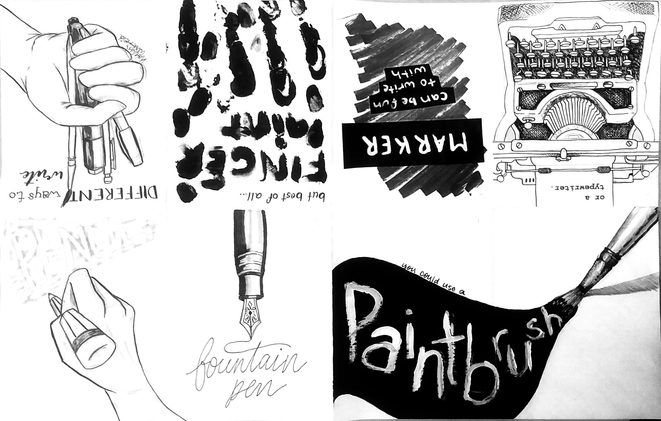
For my zine, I chose to write about writing because we had to make ours in black and white which reminded me of hand lettering and calligraphy and how that uses black and white tones to express emotion or mood with writing. Also, Ms. Casullo suggested we use different fonts throughout our zines so that reinforced my idea to do it on something to do with writing and calligraphy. In the end, I chose to make a zine about different ways people write and with what tools, and I tried to word it so it reads almost like a children’s book instead of just the words “pencil” and “paintbrush” on each page for example so it’s more of a story.
- What was the most difficult part of this assignment?
I think the most difficult part of this assignment was determining the layout and trying to decide how I should make changes to the zine to incorporate the feedback from my original draft. It took me a while to come up with ideas on how to fill some of the space and use it effectively but in the end I think I did a good job of balancing the black and white tones.
- If you could change anything about your Zine, what would you change?
I think if I could change anything about my zine it would be to spend more time developing a better layout for my pages and to spend more time shading the piece. I say this because I am still not entirely happy with the layout and colours I ended up choosing. That’s not to say I don’t like them, they’re fine, but I think if i had spent more time altering the design I would have been happier with it. I also would have spent more time on the shading because the marker I used did not end up showing up too well, especially on the front cover and the “pencil” page where I tried to shade the hands subtly.
- Do you think Zines are still a relevant art form in a tech-savvy world? Why or why not?
I think that they are, but only in a “blast from the past” or “vintage” kind of way. They’re definitely not something that would most effectively be used to convey a point or to spread facts about a topic, because in our modern day and age that is best done in an informational viral Instagram post or in a TikTok. However, as a way to advertise something like a 70s themed event or the opening of an old video store, I think it would be tasteful to use the same form of advertisement that they did back then. Also, because of the nature of the design of a zine, it would be an easy thing for something like a highschool kid to replicate if they wanted to have a physical thing to hand out as an advertisement in addition to a digital post.
- Which 2 Elements of Art and 2 Principles of Design did you use? How and where did you use them in your Zine?
In my zine, I used the elements and principles of line, value, space, and balance to draw the viewer’s eye and to make my piece interesting to look at and read.
For the element of art “line” I used different kinds of drawing utensils (pencil, paintbrush, calligraphy brush pen, fineliner etc.) to create the effects of the drawing utensil mentioned on those page(s). For “pencil”, there are visible pencil marks, for “paintbrush” you can see where the bristles of the brush created imperfection and for “finger paint” you can see the imperfections in the fingers and the uniqueness of the finger prints.
For the element of art “value” I used different shades and tones of grey marker to create shading and depth and I used white pen and white chalk marker to create highlights and high points to accentuate and contrast the darker parts in the shadows. I used fineliner in a hatching fashion to show depth and shadow specifically on the “typewriter” page and also on the metal grip on the paintbrush on the “paintbrush” page.
For the principal of design “space” I designed each page specifically for that medium and used the area I had to the best of my ability to convey the message, or more specifically, the feel that I personally get from each medium. As an example, on the “typewriter” page, I filled most of the page, almost cramped with the machine because typewriters are normally heavy, impractical and oversized, but they’re also beautiful in a vintage and older kind of way which is why I also took so much time with the details and the hatching in the shadows of the machine. For marker, I kind of scribbled across the middle of the page in grey because makers are sometimes used by kids to colour in a colouring book or to block out large areas of colour evenly which is why I added in the black pieces of paper with white marker writing on them to represent that as well. To me, markers fill up a lot of space which is why I designed the page that way.
For the principal of design “balance” I used dark and white contrasts and grey midtones to draw the eye and capture attention. I tried to break up large amounts of white space with a black accent or a grey background and I tried to break up large black areas with white lettering or highlights. For some of the white areas like on the front cover I tried to break up the large white space of the hand with some light grey shading to the skin although I don’t think it showed up too well once the marker dried. I also tried to alternate on the pages like the “pencil” and “fountain pen” pages which incorporate a lot of white space I tried to balance with the “paintbrush” and “finger paint” pages which incorporate a lot of black space, and then I put the “marker” and “typewriter” pages which are more grey pages in between the black pages to separate them a bit more.